
The Power of a Grid
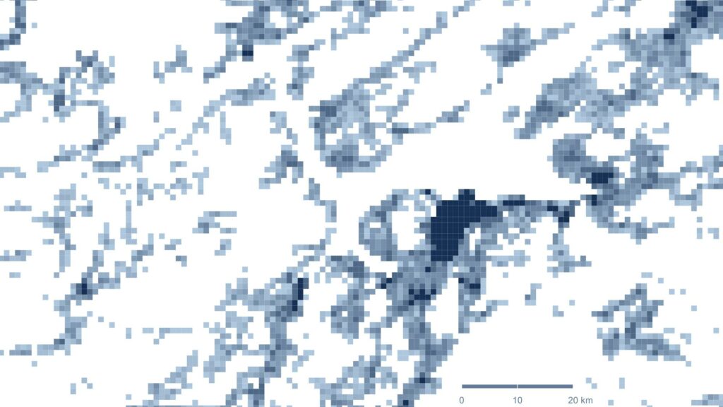
A grid is hardly interesting in itself, but fill it with content and things might start to happen. Everyone recognizes the map above, but what appears to be a usual map with land formations is actually such a grid of square kilometres, coloured after the number of people living within them.
Zooming out, the result is a description of reality where we are able identify land masses, coasts, fiords and mountains, but where the graphics infact only depict where people live. Cities turn out dark blue. The illustration forms a fascinating description of where we choose to settle, nad how the population densities vary from one region to another.
The map is based on data from Eurostat, eminently made available as open data. As our information society evolves and more and more work is based on various kinds of data, availability from authorities and organisations keep growing. This is very good news, not least in the light of turning society into something more sustainable and climate preserving. To succeed, decisions need to be based on facts and correct assessments.
If anyone finds the southern part of the Baltic Sea looking a bit flooded, it is because data on the Russian Kaliningrad oblast is not included, therefore leaving that area empty. Likewise, larger coherent uninhabited areas are left white, such as in parts of Scotland, Norway and northern Sweden.
Are you or your organisation in need of visualized data concerning projects, productions or in planning? Or of overviews of geographic areas or regions? Please do not hesitate to contact me.